Online Intake Forms Layout. Request to Change labels or edit ourselves.
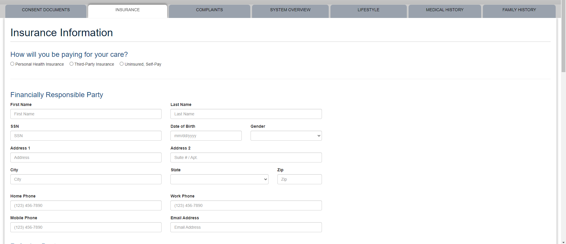
Problem: Tab Labeled, “Insurance”
Major Point: We should not assume that the patient(s) are using insurance.
Solution: The second (not editable) tab shouldn’t say, “Insurance.” It should instead say, “Payment.”
Then, the patient chooses which payment option. This would be better because if a patient doesn’t have insurance, they will skip this tab entirely and not choose a payment option, adding in-office admin time upon patient arrival.
Also, the layout in ‘insurance’ tab could be better:
1. We could have the ‘How will you be paying for your care’ a little more obvious (size, font, bold...etc.); more importantly, editable.
2. ability/option for patients to upload mobile images of their insurance card(s), saving a lot of admin time.
Q: “But why would we need to do that when they can just type it all in on the intake forms?”
A: IF the patient decides to input the insurance data at all, there are often transcription errors and we have to photocopy anyways.